
Actually, the old design has plenty of things going for it--it's simple, clean, and I am very fond of its shape. I almost talked myself out of changing it, but I then realized why just have one? I could make as many as I wanted, and rotate them all through. Seeing this as a golden opportunity to flex the Photoshop and Illustrator muscles I've gained in the past year, I set out make something awesome.
I ran into my first problem in about thirty seconds: I couldn't find the high-resolution version of the original, and Illustrator couldn't make a decent image trace out of the smaller one. Therefore, I spent the afternoon manually tracing over it with the Pen and Ellipse tools. Note to Self: the Pen tool is simultaneously your best friend and worst nightmare.
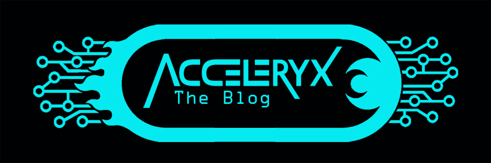
Once I finished the vectorized version of the logo shape, it was smooth sailing. For my first new version, I used a metal texture and beveled the edges for a three-dimensional look, with an outer glow for added effect. I found that the color of the glow really changed the personality of the logo, as you can see below, so I ended up saving at least a half-dozen differently colored iterations.
 |
| Side-by-side of two glow colors. I'm still not sure which I like better, but the purpose was to show how the color alters the attitude of the graphic. |
So where are the rest? Well, I can tell you that wasn't all I came up with, nor am I finished. The reality is that I only really need one at a time, so I have added a little feature box in the upper right corner of the page (yep, you found it), where I will change the logo at undetermined time intervals (I know, how very specific of me). In the meantime, you can read all my other posts! (just kidding.)
But seriously, go ahead and read them. You might stumble on something you like!
As always, feedback and input are appreciated as I explore the realms of digital graphics, and I look forward to making many more logos in the future. If you've never tried Adobe software, you might want to look into it. I've had fun, and you can, too. So good luck and Happy Building!